Mango Group
Web Design
-
Project Overview
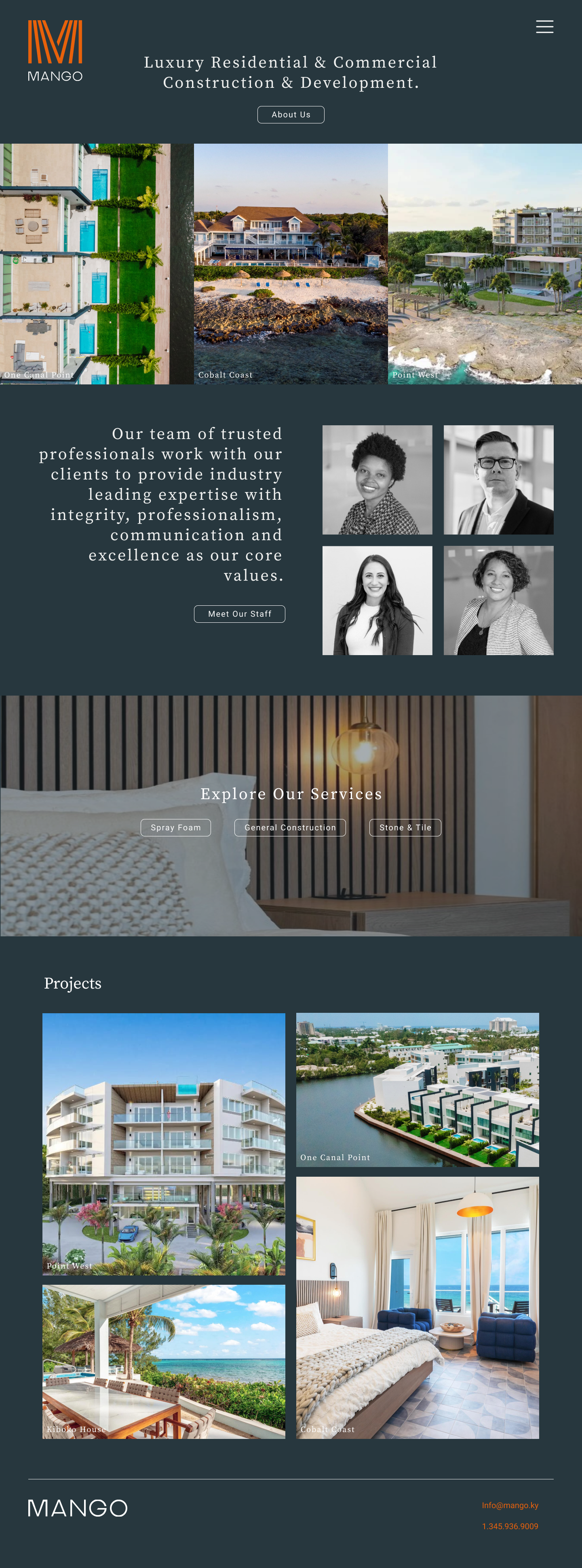
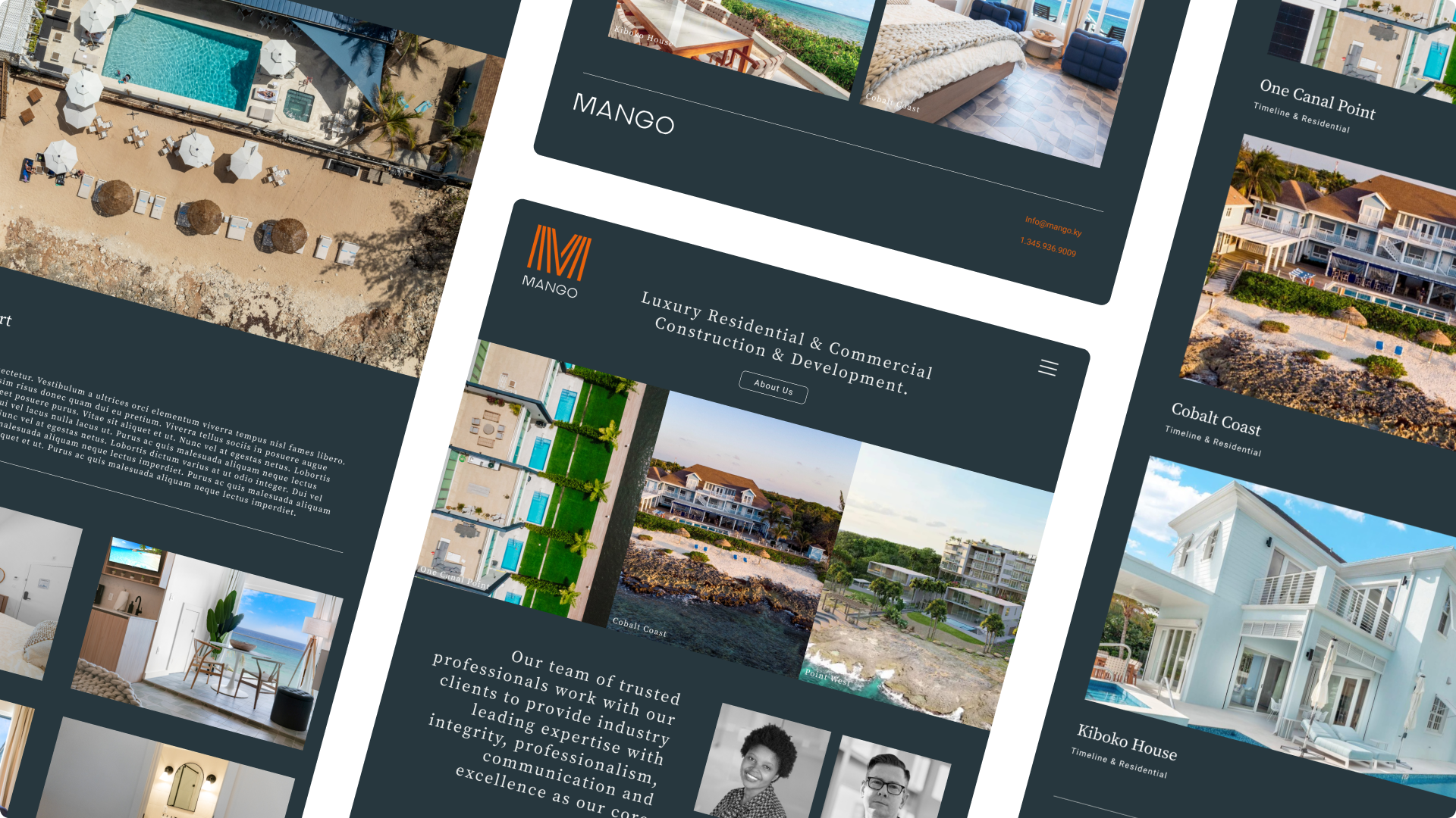
This project was an MVP website for a startup wanting to showcase their stunning projects in depth, and introduce their brand online. Mango Group is a luxury building company based out of the Cayman Islands. As a startup they wanted to get a simplistic, yet informative website launched quickly to showcase their wide range of projects, inclusive hiring, and specialty services. Feel free to explore: https://mangogroup.ky/
-
My Role
I was partnered with a Full-Stack Developer and led the charge for all UX & UI.
-
Timeframe
May - June 2023
-
Tools
Figma
Development Process
When completing a project I have my own way of following the general five step product development process of: brainstorm, define, design, test, launch.
Lets get into it!
Discovery & Research: Lets Understand it
After collaborating with the client, their research highlighted that the target audience, particularly project managers in construction and real estate development, needed access to easy to use and clear, detailed information about the company’s work when selecting bids for commercial projects. A smaller but equally important percentage of their target audience was Cayman Natives in the construction trade looking for work. Because Mango valued local talent within their team, a key pain point they wanted to solve was to provide clear ways to get connected.
The business had a few of its own goals in terms of the site being that they wanted to present specialty services like spray foam, and custom tile making from Turkish artisans. As well, opening themselves to come across more talent to scale their general construction team.
Mission & Strategy: Lets Solve it
Once I understood what the emergent needs of the business were, and the needs of the user, I set out to create a digital experience that showcases, exposes, and encourages differing users to get connected to Mango.
Here were my three points of action to achieve this:
Make points of contact easy, and evident for users.
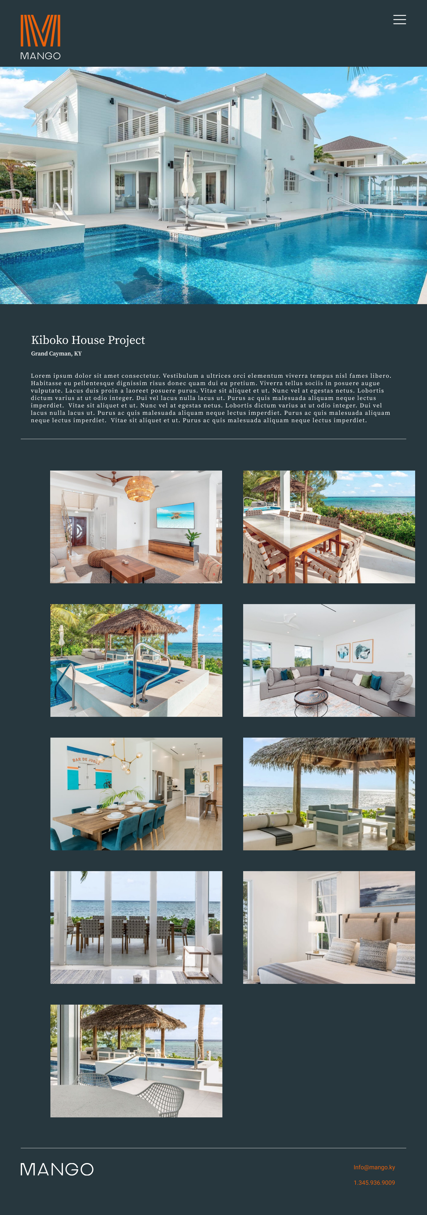
Dedicate space for specific works, services, and get informative about projects and reasons to choose Mango.
Keep things simple and effective to meet the needs of the business and the user.
Iteration & Design: Lets make it
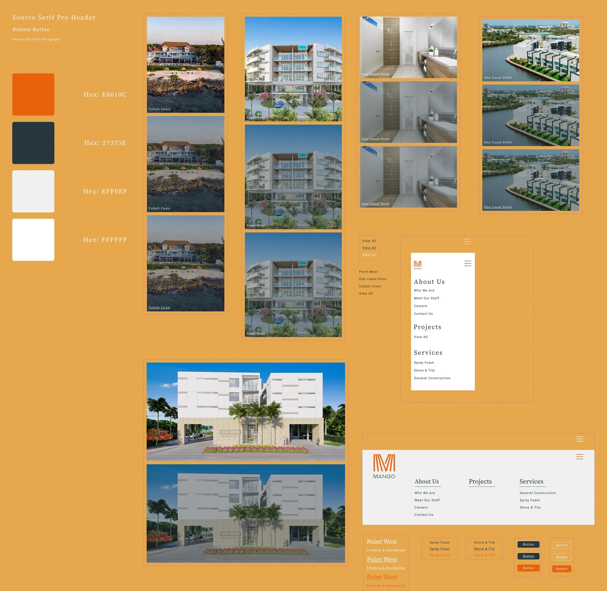
My initial step in terms of design is always pen and paper. Getting the logistics sketched out helps me leap into the first designs. Because Mango already had a brand designer craft them a logo and a color palette, I wanted to give a high fidelity feel with my initial design presentation for the sake of efficiency and quite frankly being respectful of their tight timeline to launch an MVP. Collaboration is key here, and I like to be honest and forthright with what look I’m going for so any feedback from the business can be incorporated alongside any user feedback.
Feature spotlight: The Contact Form
I wanted to make sure there was a place for not just general contact but also for resumes for local job hunters wanting to work with Mango Group. The user would need be sent here through two major pathways: the “about us”section/button on the landing page, and any button regarding “meet the staff”.
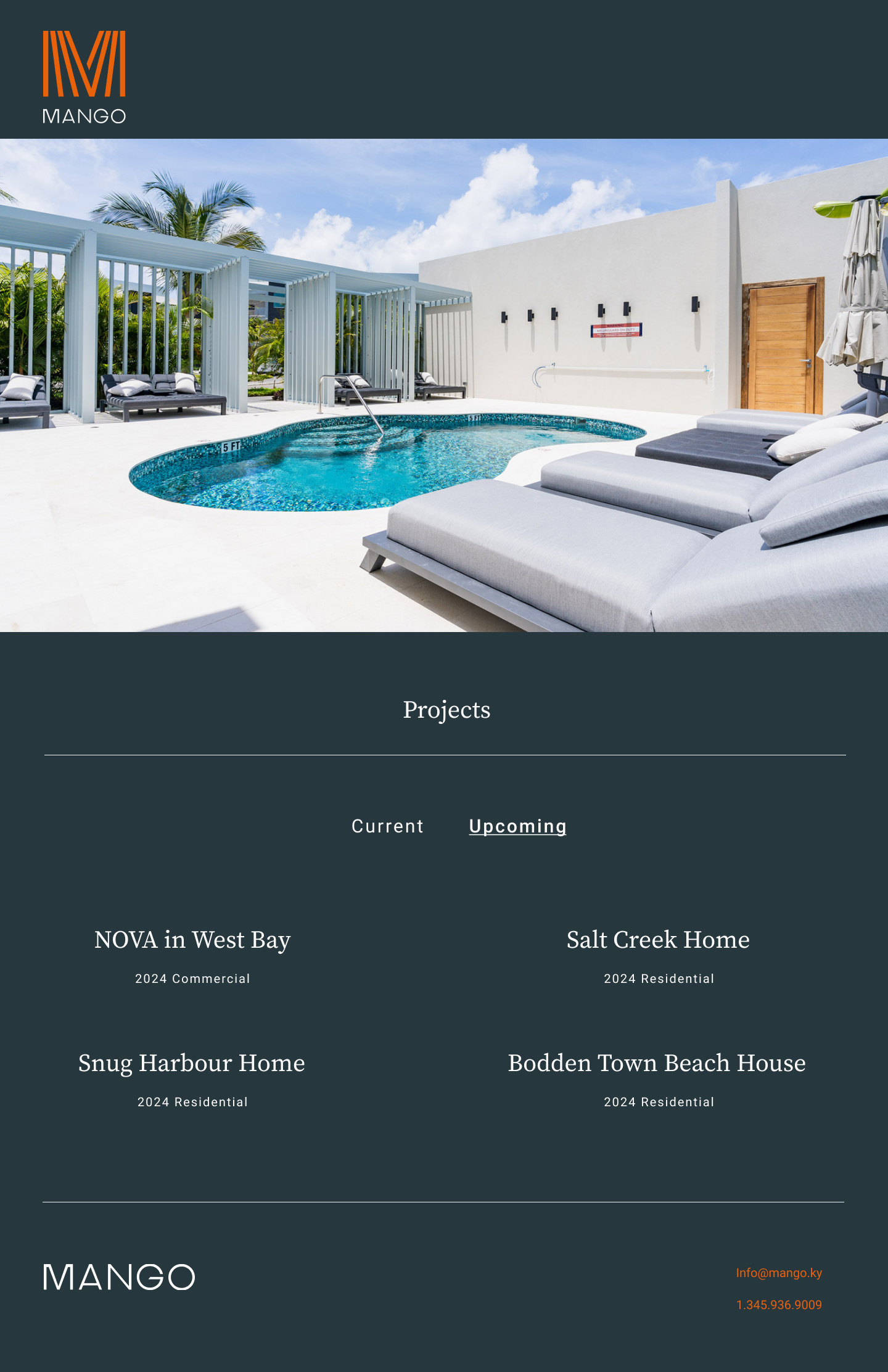
Feature spotlight: Upcoming projects
As a startup, its crucial to showcase things you have fully completed as well as momentum you have going that may not be totally ready to show off. I wanted to present current or complete projects the company has completed (or is still completing) as well as new contracts forming for the future. I wanted their following to be completely informed while also stoking some excitement. Not to mention, bolster Mango’s resume.
Feature spotlight:
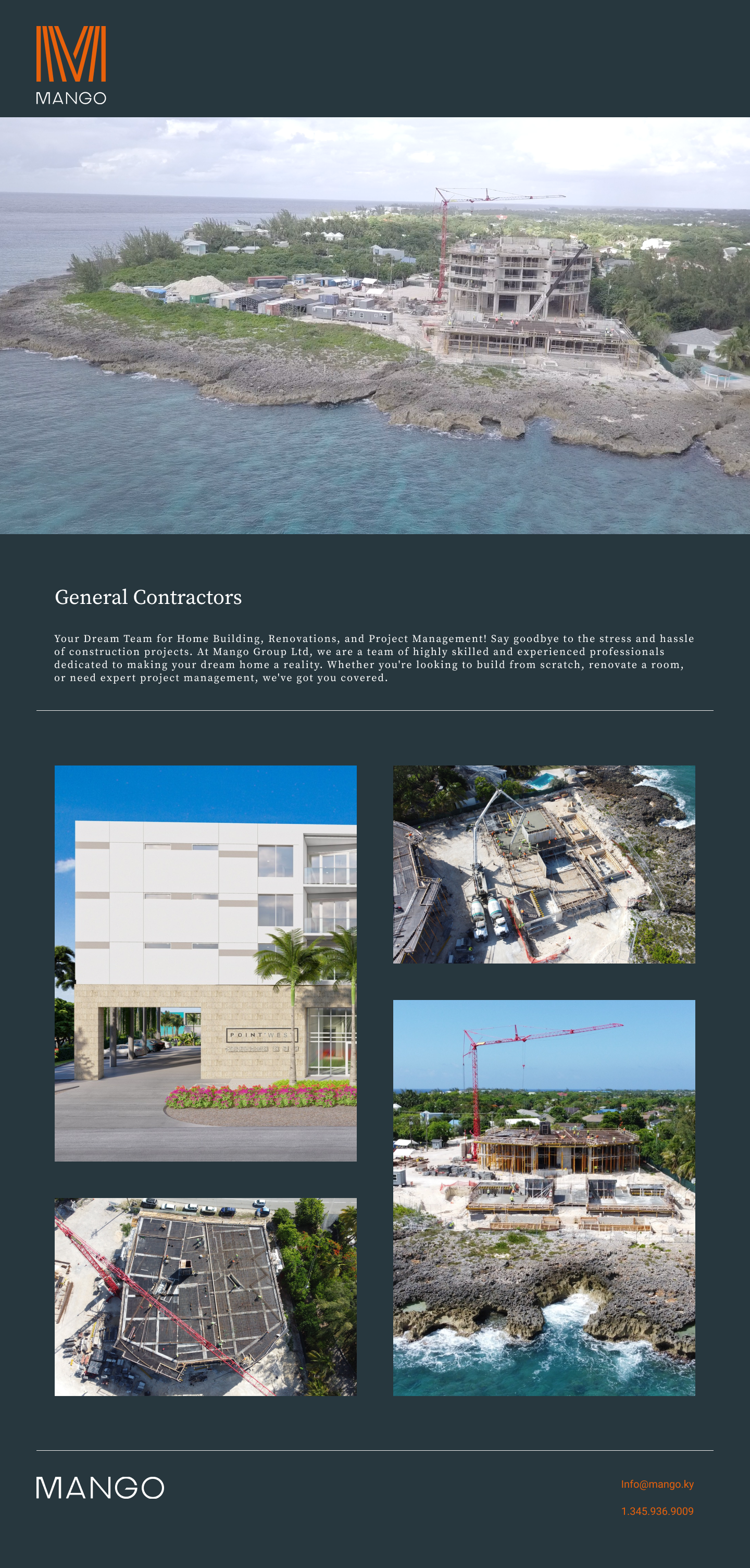
Service Displays
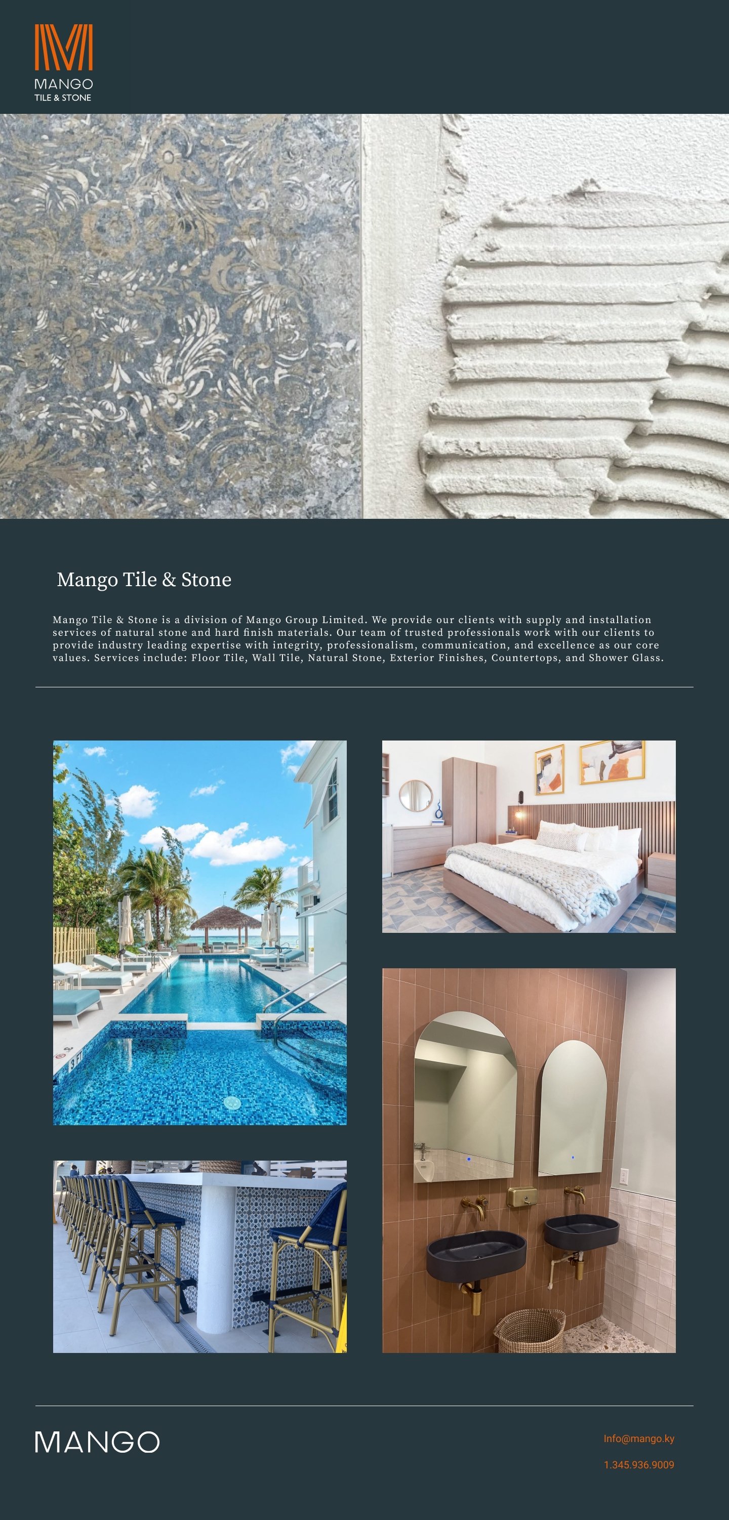
Mango Group truly does it all, and their site needed to communicate that. Each specialty service got its own dedicated page for images, deep dive information, and even ways to benefit the client/residents
Testing: Lets adjust it
After a round of prototype testing two major adjustments were made to the final designs:
1. Moving the contact form to the landing page while making an additional contact us page wherein it would live double exposed.
2. Simplifying the menu out of a concealed window and displaying each section outright within the homepage
Takeaways
Next steps?
Ultimately Mango’s site will need a expansion from a minimum viable product to a more built out experience as their business naturally blooms. My hopes specifically would be to gather fresh data and analyze any metrics and performance details to revamp the site to scale and better accessibility/efficiency.
What did I learn?
Because this was one of my first site builds from beginning to end, being open to walk away from previous ideas for the sake of improved functionality was paramount for me. I’m incredibly grateful to the client for their level of collaboration.


