Soko Jewelry
App Design

-
Project Overview
Soko Jewelry is a women-led, ethical brand that pushes local Kenyan artisans into the global market through an online platform. I was tasked to create a simple shopping app for the brand. I ended up creating a mirrored brand to Soko’s website design with increased accessibility features for the user. This was a concept design project through my UX Design certification via Google.
-
My Role
Because this was a solo project, I was the main UX/UI Designer in charge of research, wire-framing, prototypes, and information architecture. This project was tasked through my certification program via Google.
-
Timeframe
May 2022
-
Tools
Figma, Adobe XD, Google Drive
Development Process
When completing a project I use the five step product development process: brainstorm, define, design, test, launch.
Research Strategy: Part I
I began user research by aiming to understand trends and needs for jewelry apps in the marketplace and what was lacking. Research showed that the jewelry industry was experiencing immense growth. As well, 55% of users desired to know where the pieces were made (and who made them) but struggled to find that type of clarity within their online experiences. After conducting several online surveys with jewelry shoppers, I gathered information for personas that appeared to be persons who identify as women around the age of anywhere from 17 - 56 years old. a few pain points were identified:
Users struggle to find information on where their jewelry is sourced, and its impact on their communities.
Lack of accessibility features causes the user journey to become frustrating.
The process of online shopping for pieces that are sustainably made can be too time consuming and unclear.

Audrey is a young professional who loves online shopping. However, Social media ads can be overwhelming and the buzz words sustainable are often green washing and flaky.
Research Strategy: Part II
A journey map was made to better understand the user’s perspective when navigating their experience through an app. My main focuses were to insure time efficiency and ease.

-
Hand Sketched Wireframes
Because the flow was already modeled, I played around in the hand sketches of layout, features, and accessibility.

-
User Flow
Working alongside the brand’s web design, I wanted to keep the app parallel in flow.

Lo-Fi Wireframes
These are a few of my initial digital sketches of budding ideas for the app flow.


Style Guide
When it came to color and style, I kept with Soko’s colors of pink, orange, and an ivory color. It aligned with the brand’s colorful story. I made slight changes to font choice, but otherwise played it safe.

Usability Study
I had 10 people navigate the digital wireframes during a moderated interview via Zoom. There were lots of growth opportunities to change like a unsophisticated or clunky layout, difficulty finding features like the wishlist, and not knowing what the accessibility icon stood for.
Findings on Lo Fi Prototype
Affinity Diagram
After conducting interviews on my wireframes I organized all comments, and noteworthy thoughts into a diagram to rein in my focus on what needed to improve.

Adjustments After Usability Findings
-

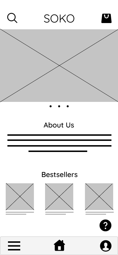
Toolbar
I wanted to make navigation as easy as possible, so I used a simple bottom toolbar with familiar icons to aid in clear navigation for the user.
-

Icon & Menu
Because the findings posed the idea that features were hard to find, I double exposed icons as a toolbar and text banners within the upper left menu for easier access and a happier user journey.
-

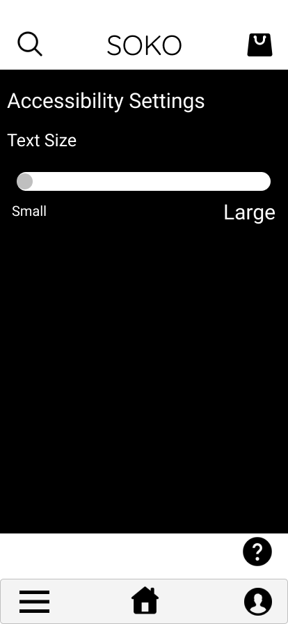
Accessibility Switches
This is one of the double exposed accessibility pages, this particular pop up is a quick access to alter font size, turn on a screen reader, or change the display for light sensitivities. Turn on by dragging from left to right like a switch.
High Fidelity Mockups


Takeaways
What is this solution’s impact?
Overall, I created a very paired down app for an ethical brand.
What did I learn?
The needs of the user, needs of the user, the user. I went in to this design with a lot of preconceived ideas of how I would want it to look via UI. However, after conducting interviews I realized how disconnected I was to the user’s needs, and the feedback I received within the usability testing overall improved the design. This project was an incredible reminder that when you put the user first, the rest will follow.
Next Steps?
With each design I could easily change everything for years to come and still feel as though there is progress and improvements to be made. Realistically I would first, I think the app could be further expanded in simplistic function and in much greater detail.
I would like to include more collaborative technologies that save time for the user while shopping and engaging with the brand.
My next steps would be more expansive accessibility features for all users like AI assistive technologies.